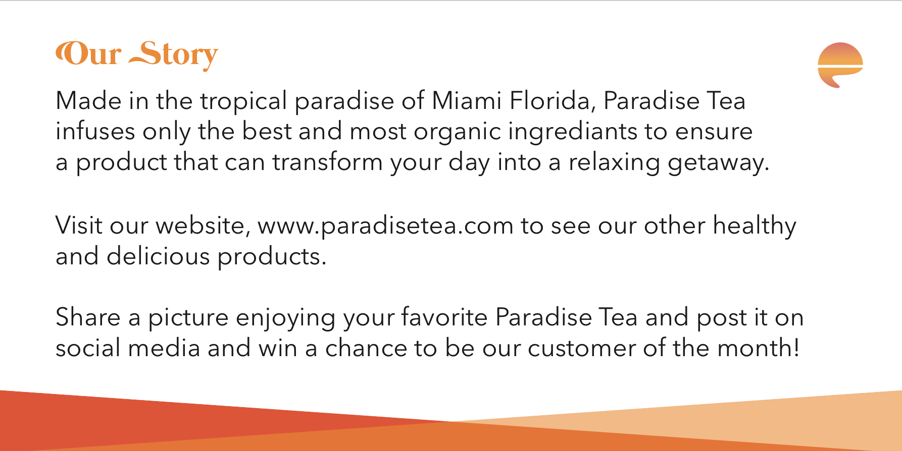
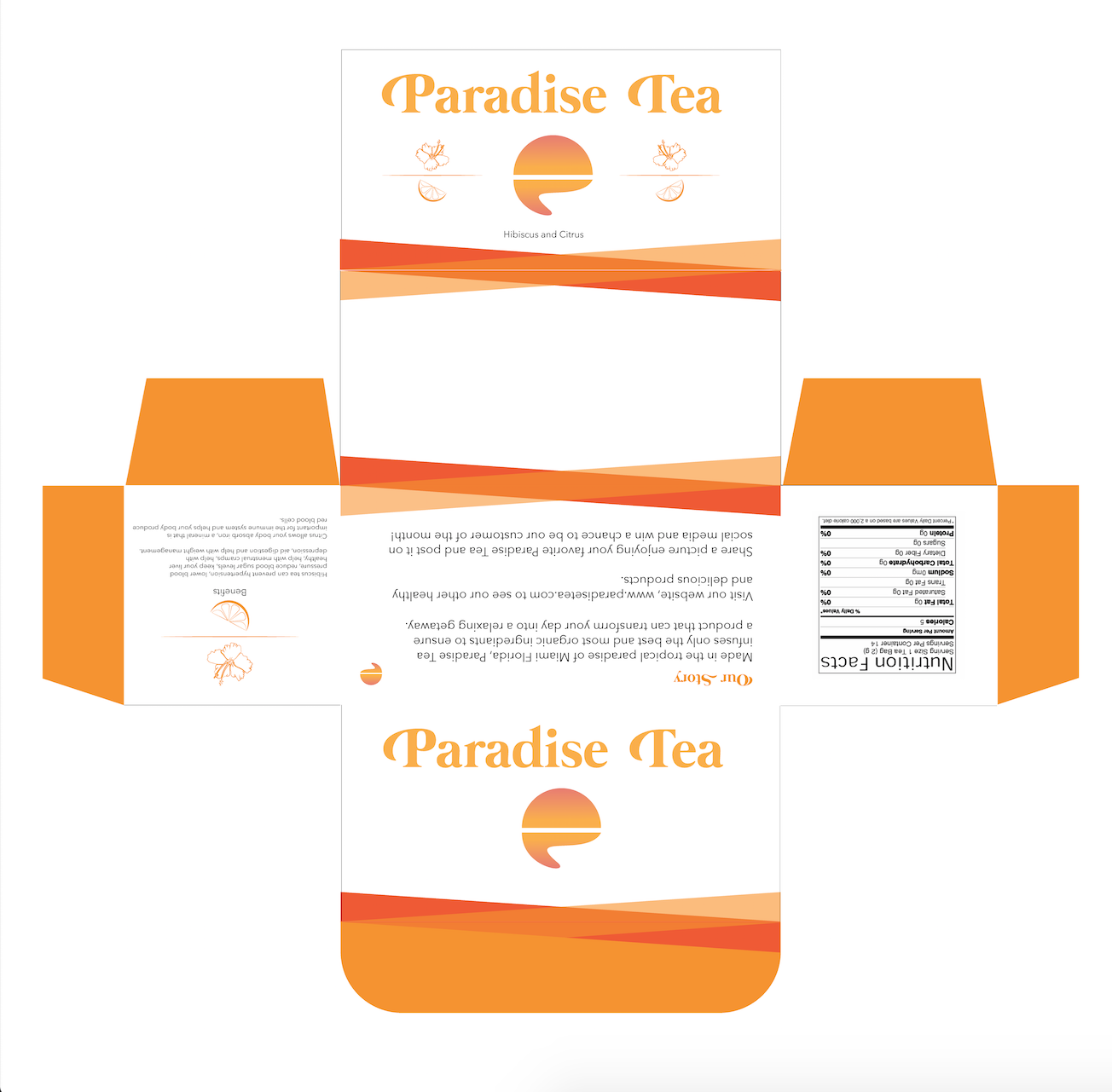
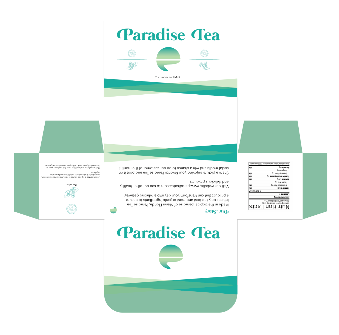
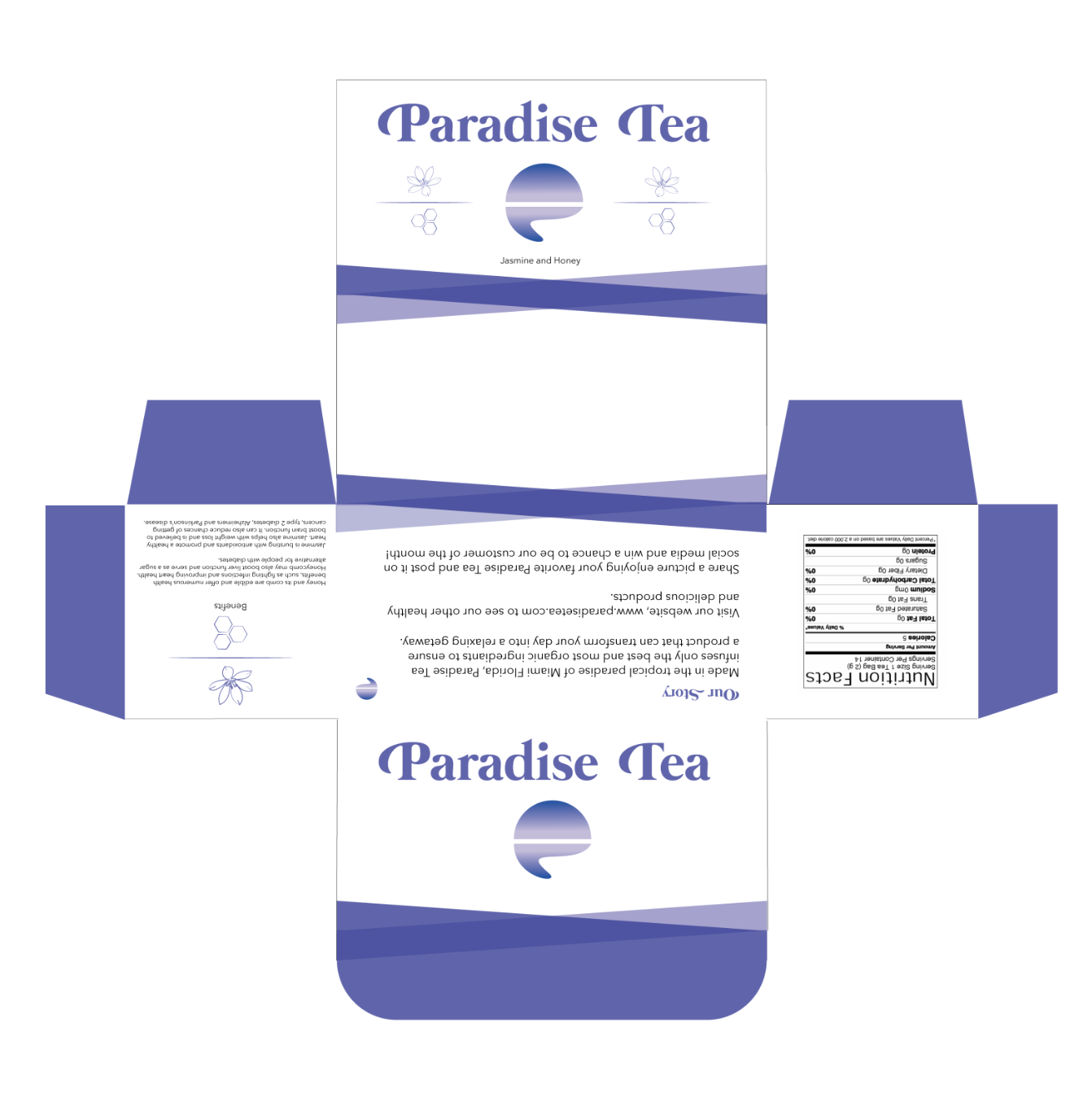
This was a made-up tea brand that focused on package design along with printing.
This project allowed me to gain package development skills in Adobe Illustrator and brand application by staging photos with the tangible product.
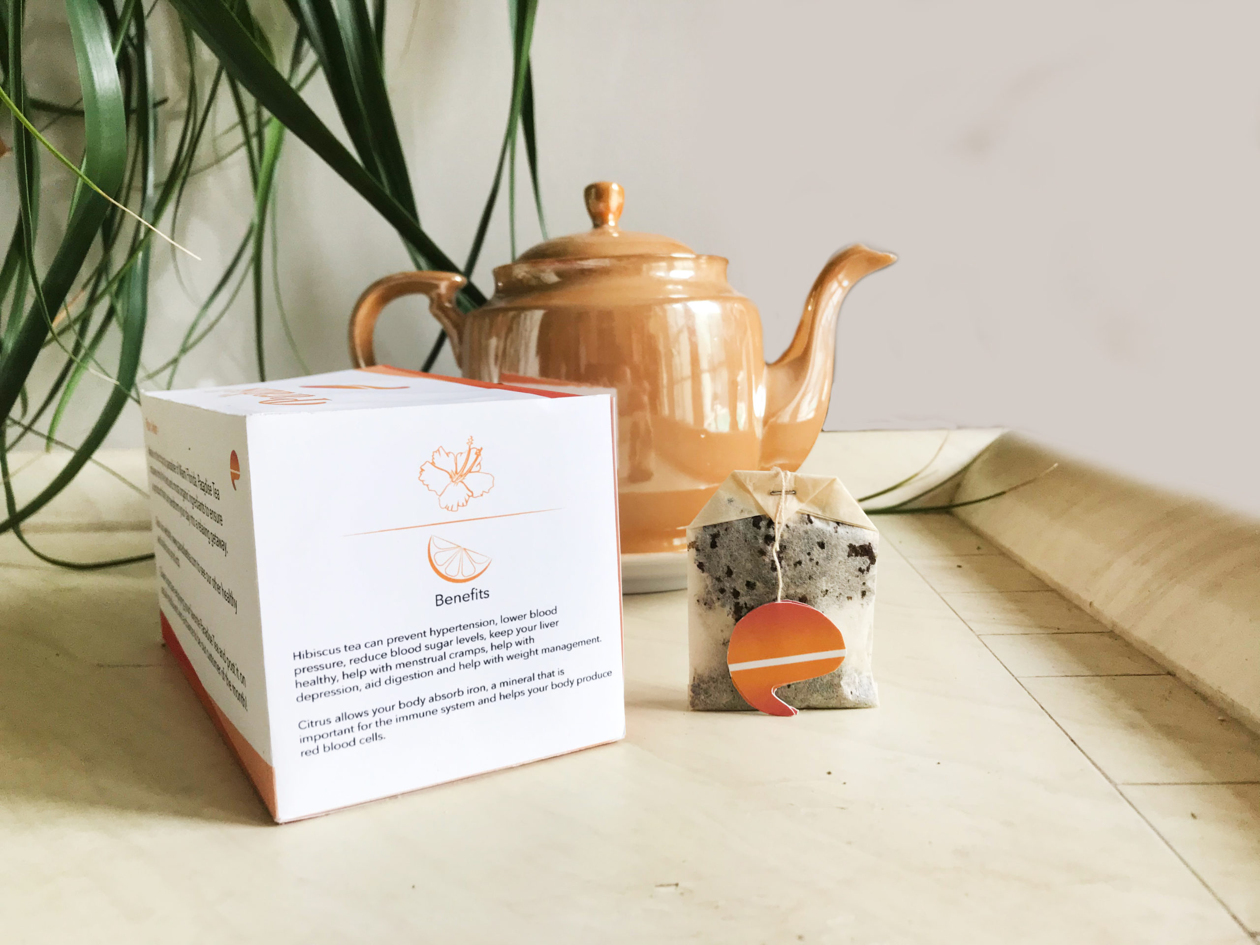
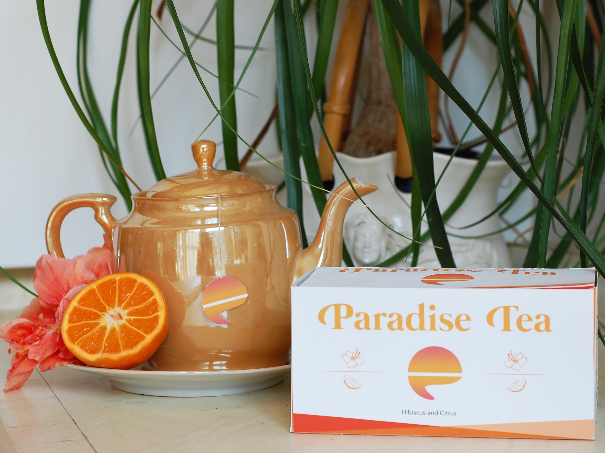
The teabag tabs are cut outs of the logo, so that when consumers drink the tea, the brand’s logo becomes easily recognizable. The inspiration behind the logo was a setting sun over the ocean in a paradise, tropical location and as it sets the sun becomes a “P” shape.
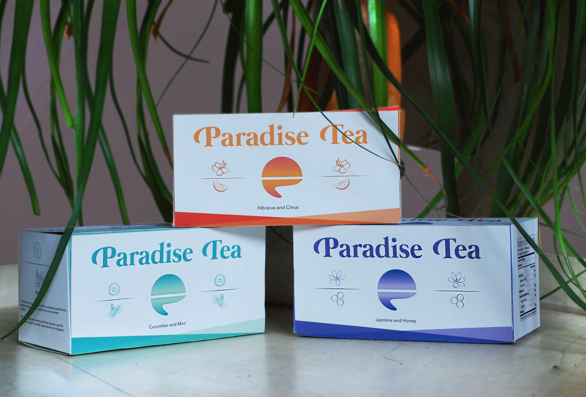
The typeface used in this design was Avenir Next Light and Book for the body copy. Mermaid Swash Caps for the brand name.
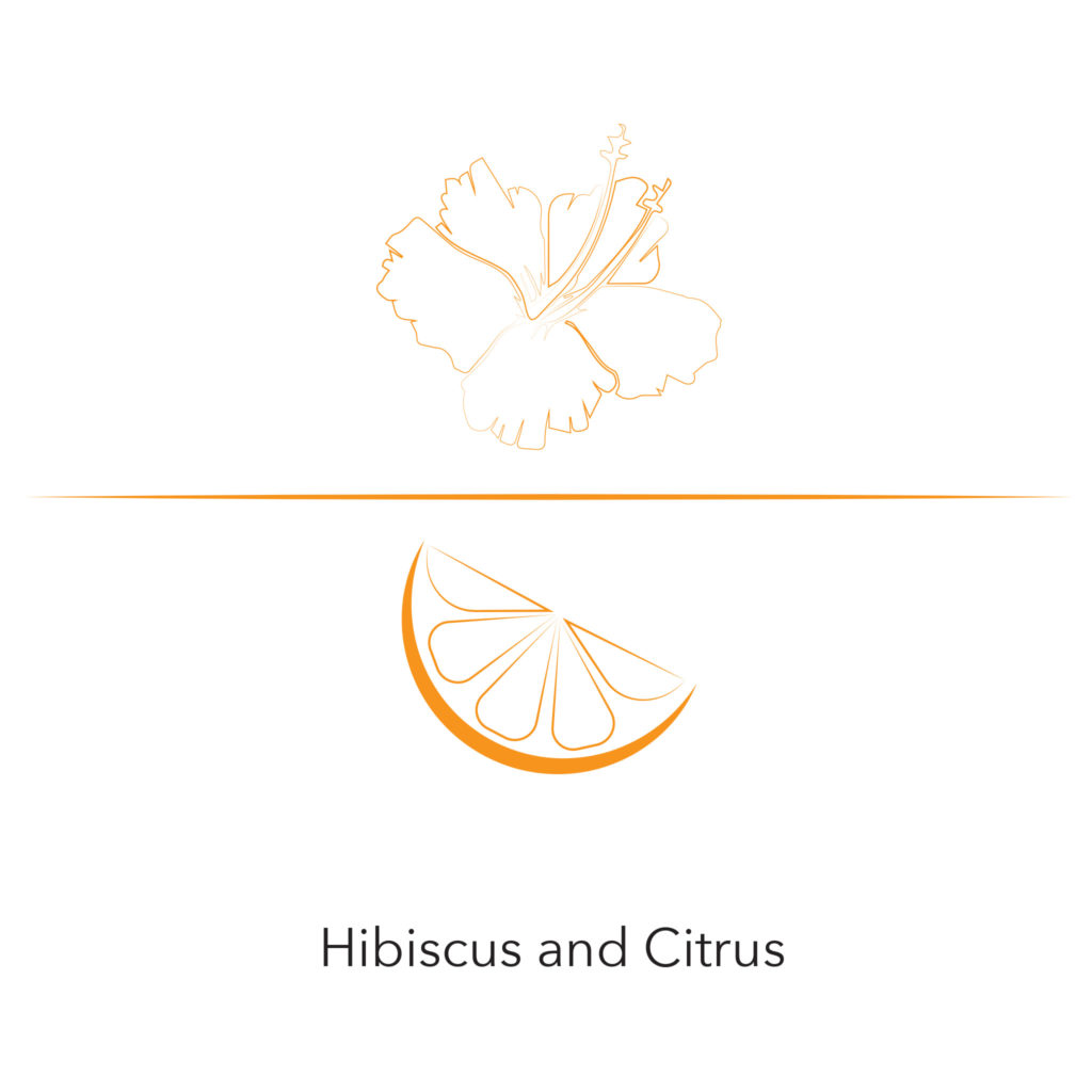
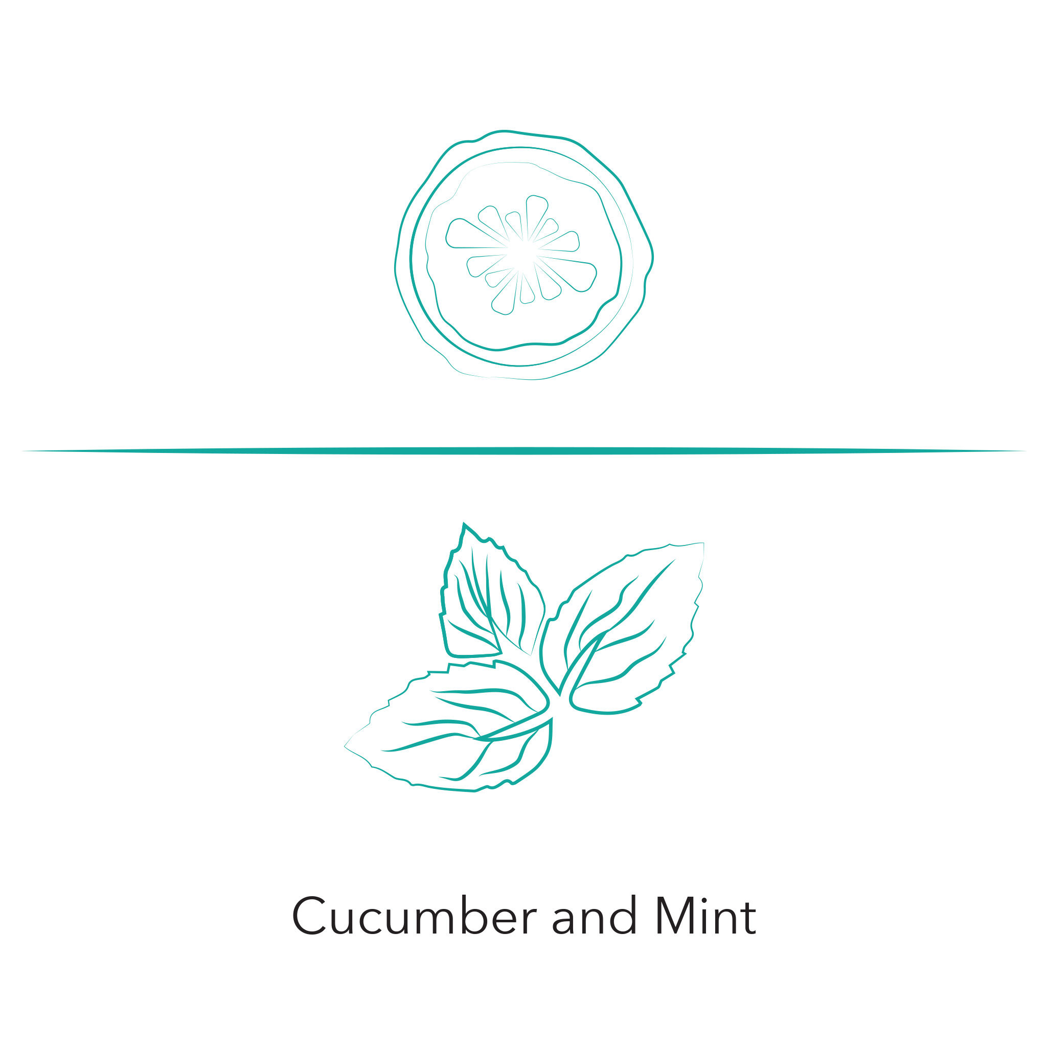
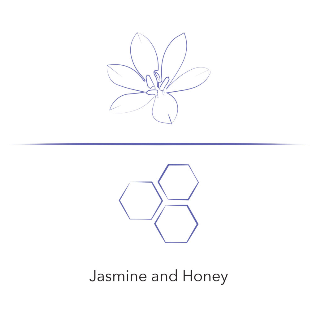
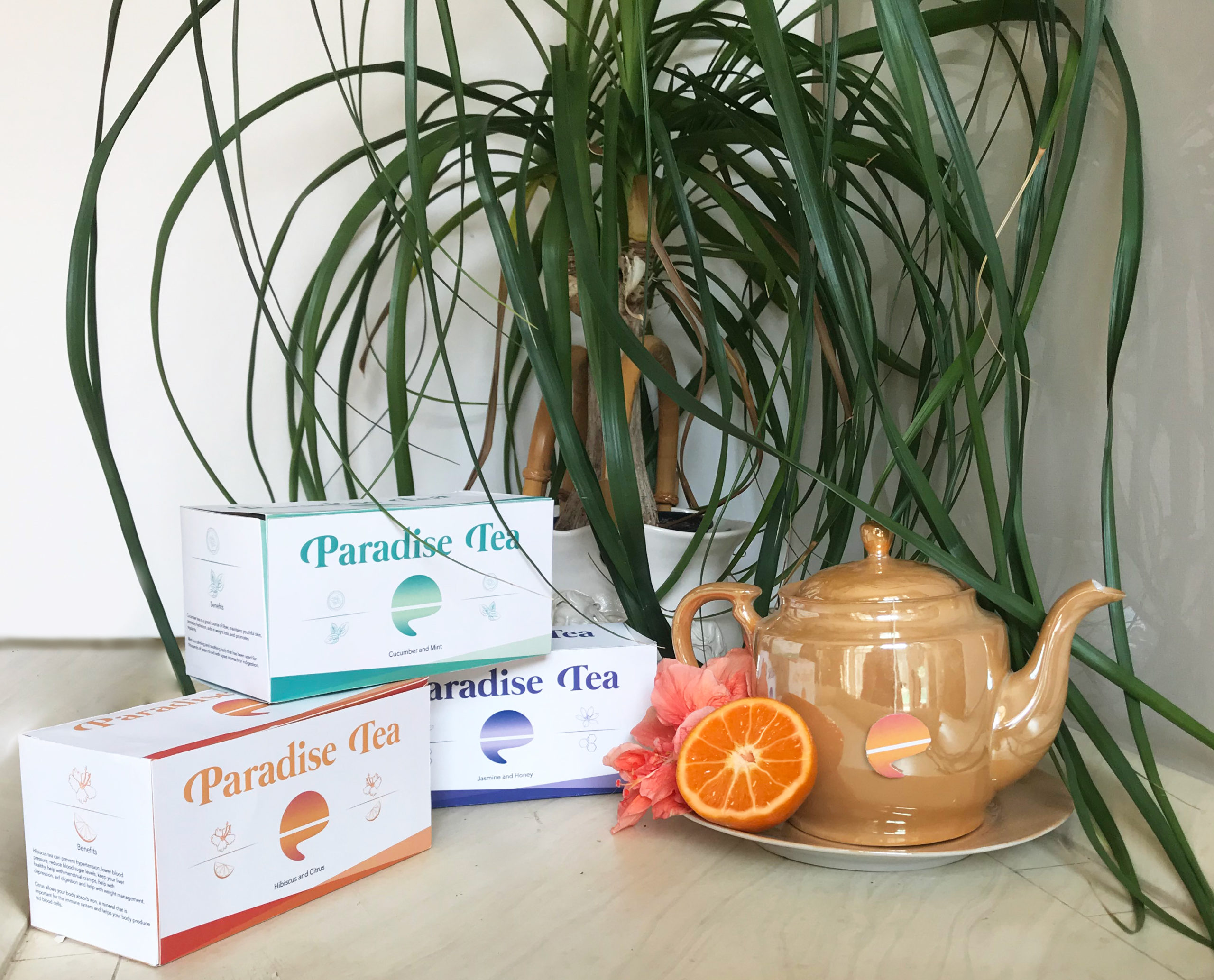
I wanted this brand design to be fun but also sleek and modern. The colors change depending on the flavor of the tea but the layout remains consistent. The illustrations of the flavor is done in smooth contour lines. The lack of fill color allows the overall look to feel light and calm.
The packaging includes the brand’s mission and overview, flavor, health benefits, and nutritional value.
